Every café, regardless of the size of its location—from a small local shop to a global giant like Starbucks—needs an appealing and effectively designed coffee menu board. It is not just a list of beverages; it helps customers make a decision, reminds them of the brand, and makes the café experience more enjoyable. Wherever the menu is written—on a chalkboard, on a piece of paper that illuminates the wall, or as an electronic display—the design of the menu board influences customers’ decisions and sales results.
This article overviews the types and principles of menu boards, how they can be designed, and how they affect the customer experience and the café brand.
What is a Coffee Menu Board?
A menu board is a method of presenting coffee services, prices of coffee products, and related products often used in cafés or coffee shops. However, conventional blackboards have been widely used for many years, but currently, digital menus or printed ones are more popular among establishments to meet customers’ expectations.
Many people believe that menu boards are very useful to convey customers’ information when ordering foods and beverages during rush hours. A well-planned coffee board also provides the prospects to sell additional items such as pastries, specialty syrups, or milk upgrades.
Components of a Good Coffee Menu Board
1. Clear Categorization of Beverages
Organizing items in categories presents them in a format that can easily be searched by a customer in search of specific drinks. A typical coffee board might include sections for:
• Espresso-Based Drinks: Espresso, Latte, Cappuccino, Macchiato
• Drip Coffee and Brewed Coffee: American, Pour over, Cold brew
• Specialty Drinks: Regular drinks include Mocha, Chai Latte, Matcha and seasonal beverages.
• Non-Coffee Drinks: Hot Chocolate, Teas, Smoothies
• Add-Ons: These include: other milk products, extra shots, flavored syrups, and toppings.
This structure eliminates confusion so that the ordering process is seamless and fast.
2. Pricing and Product Offerings
Customers appreciate it when the prices that are being charged are revealed to them. Writing down drink sizes (small, medium, large) and their prices helps customers to trust sellers and avoid misunderstandings at the time of payment. Moreover, options such as milk options (almond, oat, and soy) and extra shots of espresso should be included to push for upsells.
3. Highlighting Seasonal and Limited-Time Specials
Cafes always release their new products or specials during certain times of the year; for instance, during the fall, you get a pumpkin spice latte, while during the holidays, a peppermint mocha. Placing these options on the menu board makes people feel that they need to try them now before the offer expires or they will not be available the next time they visit the café.
4. Energy Values and Nutritional Data
It has become mandatory in most areas to provide calorie information for the sake of compliance with the legal requirement for transparency. While it is not always required for restaurants to list calorie information, doing so can attract customers that are conscious about their health and increase customer satisfaction.
5. Brand Image or Identity and Look and Feel
The menu board is a part of the café’s total branding and an embodiment of the café’s personality. From a homemade hand-drawn chalkboard that gives warmth to a store to an LED screen that highlights simplicity and professionalism, it should fit the atmosphere of the coffee shop. This ensures that customers can identify and remember the organization’s brand image without having to be told about it.
Types of Coffee Menu Boards
1. Traditional Chalkboard Menu Boards
Chalkboards have a nostalgic, handcrafted appeal, making them ideal for independent cafés and shops aiming for a rustic or cozy aesthetic. Baristas can update chalkboards daily, adding a touch of personality by hand-drawing illustrations or quotes.
Pros:
- Low-cost and customizable.
- Perfect for small coffee shops with frequently changing menus.
Cons:
- Time-consuming to maintain.
- Limited visual impact compared to modern digital boards.
2. Printed Menu Boards and Backlit Displays
Many cafés opt for printed menus, which are laminated or backlit for easy visibility. These boards offer a more polished and professional look, especially for chain coffee shops that maintain consistency across multiple locations.
Pros:
- Professional and uniform appearance.
- Suitable for high-traffic cafés with fixed menus.
Cons:
- Inflexible for frequent updates.
- Printing and installation can be costly.
3. Digital Menu Boards
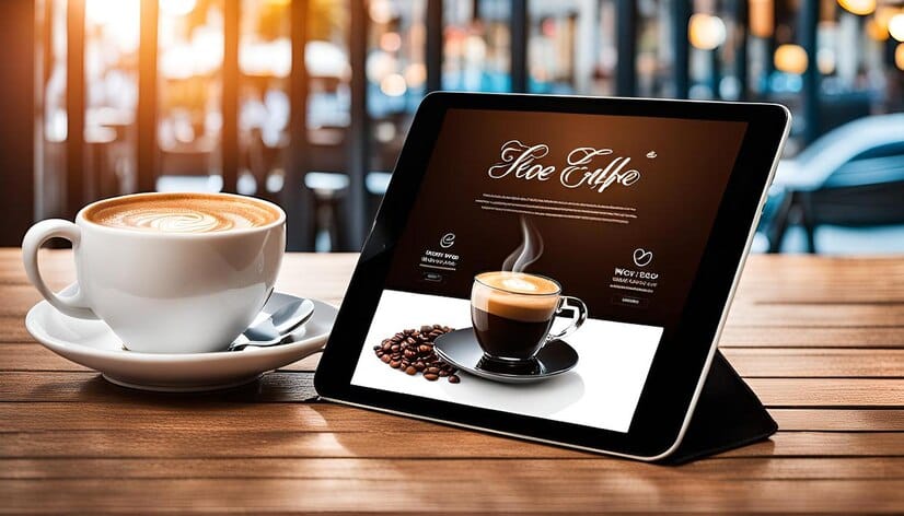
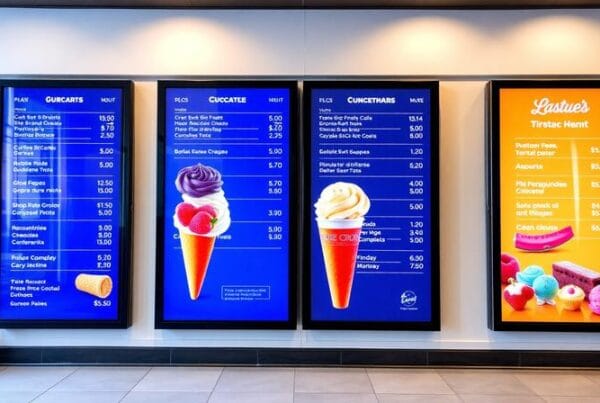
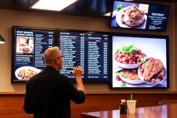
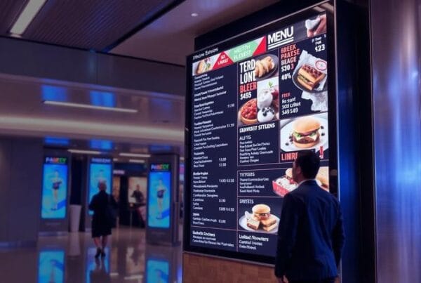
Digital screens are becoming increasingly popular, offering flexibility, ease of updates, and visual engagement. With digital menu boards, cafés can display rotating menus, videos of brewing processes, or customer promotions. Additionally, these systems often connect to cloud-based software, allowing remote updates in real-time.
Pros:
- Easy to update with new items or prices.
- Supports animations, videos, and rotating content.
- Can highlight limited-time offers to boost impulse purchases.
Cons:
- Higher upfront investment.
- Requires technical maintenance.
Design Tips for an Engaging Coffee Menu Board
1. Use a Simple and Clean Layout
Coffee shops have a short time when they can attract a customer’s attention, especially during the morning rush. Lack of much writing combined with a neat look means that customers can read the board without any delay. Do not confuse them through numerous options—combine similar drinks into categories and place the most popular items in the focus.
2. Integrate Effective Graphics
Place quality pictures of key drinks to create appetite for such drinks among the clients. Pictures of coffee being poured, steaming lattes, or some seasonal special can persuade customers to order something they have not tasted before. But care should be taken not to overdo it; when the board is full of images, it becomes rather confusing and hard to read.
3. Strategically Highlight High-Margin Items
Menu boards are the best for indicating changes or potential for higher-priced beverages. For instance, place your specialty products, such as lattes or cold-brewed coffee, at eye level and call out for special flavors (e.g. $0.50 for vanilla syrup).
4. Use Colors that Reflect the Café’s Atmosphere
That is why hue is one of the most important factors that define the character of a café. A small and inviting café would probably use shades of brown and green, while a modern and popular coffee shop would use minimalism or soft colors such as baby blue or baby pink. Remember about contrast—when the text is light, it is easier to read it on the dark background (and vice versa).
5. Integrating Motion to the Digital Boards
For digital coffee menu boards, one can use soft animation or change over to help create focus without necessarily diverting the attention of the customers. For instance, while using a breakfast promo, it will be effective to switch to the menu every few seconds in order to make the presentation interesting without confusing the audience.
How Menu Boards Affect the Customer
1. Encourages Impulse Buying
Boards that are specially designed to contain seasonal specials or limited-time offer work under the fact that customers are usually afraid of missing out (FOMO) on something.
2. Reduces Decision Fatigue
A good coffee menu board enables customers to make quick decisions, so that some people do not have to be waiting in a long line during rush hour. Divided and well-organized sections, as well as easily readable fonts, make the customer’s choice as seamless as possible.
3. Promotes Brand Loyalty
Uniformity when using menu boards helps to build the coffee shop’s brand. If consumers have a positive attitude towards a particular brand, they will likely come back and recommend the café to other people.
Menu boards and the future of coffee
1. AI-Powered Recommendations
Few of the digital menu boards are using artificial intelligence to give suggested options. For example, these boards could recommend certain beverages, such as iced coffee for a hot day, hot chocolate for rainy days or drinks that are preferred by the customer based on their past orders for the loyal customers.
2. Sustainable Solutions
Since cafés are also trying to introduce the idea of reducing carbon footprint, more shops are utilizing digital boards and avoiding the use of paper. Other examples for applying customer values include creating and promoting on the menu board an environmentally friendly theme like offering a lower price to those who bring their own cups.
3. Menu Systems activated by voice and/or QR codes
To adapt to the contactless service tendencies, voice-activated menu boards or QR code menus are increasingly used. Some of the customers can use the smartphone to scan the QR code that is placed on the menu board to make their orders.
Conclusion
A coffee menu board is not just a slab on which to list your offerings, but a key part of the customer interface and a marketing asset. Whether a simple chalkboard, a printed backlit sign, or a high-tech digital signboard, the right design will increase sales, promote brand image, and improve business flow. In the modern world, businesses adapt to new technological changes to improve the provision of services in line with the customers’ needs and expectations in the operation of coffee shops.
This is why cafés should pay attention to the ways to make menu boards clear, beautiful, and promoted: a well-designed and promoted menu board is a part of the coffee experience that customers will look forward to.


