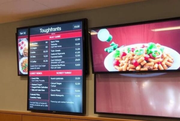
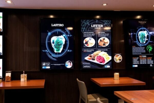
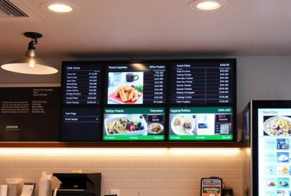
An effective menu board is designed to elevate the customer experience of a restaurant and stimulate sales. It does not only inform customers about their options but also influences what they wind up ordering and designing effective menu boards for restaurants mandates following best practices.
Understand Your Audience
An effective menu board is designed with the customer in mind. Do many customers come in as families, college students, or business professionals? If you know your customer demographic and what they like, information such as this will strengthen your menu board design. For example, a family-oriented restaurant might employ fun fonts and bright colors, whereas a high-end restaurant might lean toward an elegant, minimalistic design.
Emphasize Readability
A menu board should be able to be read and comprehended at a glance. Here’s how to make it happen:
Font Size and Font Style
- Font Size: The text has to be of a size that should be read from a distance. Main items should receive the most significant font size, followed by sub-items and descriptions.
- Font Style: Choose simple, sans-serif fonts for clean readability. Do not go with highly decorative fonts, as they are difficult to peruse at a glance.
Contrast and Color
- Contrast: Use a contrast in high color combinations (such as black text on a white background).
- Color: Limit the number of colors to avoid overwhelming the eyes. Stick to a consistent color scheme that aligns with your brand.
Layout and Spacing
- Layout: Lay out the menu logically and group like items together. Separate the various items under appetizers, entrees, desserts, etc.
- Spacing: Adequate spacing between items prevents the board from looking cluttered and helps customers find what they’re looking for more quickly.
Highlight Key Items
Lead customers to items that are high-profit or signature dishes by using visual cues. This can be done through:
Visual Hierarchy
- Positioning: Place bestsellers or high-margin items at the top of the menu or in the middle where the eye naturally drops.
- Emphasis: Use boxes, borders, or different background colors to draw attention to these items.
Imagery
- Photos: High-quality pictures of food items can be persuasive. Make sure appetizing and realistic looks and images are taken.
- Icons and Symbols: This includes chef’s recommendations and spicy or vegetarian symbols which can convey information quickly enough to guide customer choices.
Incorporate Branding
Your restaurant signage design should portray the following:
Consistent Design Elements
Logo: An essential element will be your restaurant logo.
Brand Colors: Apply the brand’s color palette consistently on the menu board.
Typography: Make sure the fonts are complementary and give it that professional look about other branding materials.
Brand Voice
Descriptions: Write descriptions on your menu in your brand’s voice. It can be formal, casual, or quirky, but consistency is critical.
Storytelling: If applicable, share a quick anecdote or fun fact on a signature dish or the restaurant’s history to intrigue your customers.
Leverage Technology
Digital menu displays provide the flexibility to have dynamic content. Customer experience can be improved in endless ways with:
Digital Menu Boards
Updates: Update menu items, prices, and specials quickly and easily at absolutely no cost of printing new boards.
Animations and Videos: Use subtle or looping videos to emphasize certain items or promotions.
Dayparting: Modifying the menu at intervals throughout the day or for meal times, e.g. breakfast, lunch, and dinner, to reflect relevant items only.
Interactive Elements
QR Codes: Use QR codes for clients to scan for more information, nutritional information or place an order online.
Touchscreens: Touchscreen menu boards enable self-service in restaurants by allowing the customer to easily configure their choices without the need for any other assistance.
Compliance and Accessibility:
Ensure your menu board is compliant with local regulations and accessible to all your customers.
Accessibility
- Readability: Text should be large enough to read for visually impaired customers and present sufficient contrast for better readability.
- Braille: Your facility should have a Braille version of your menu.
- Language Options: If located in a multi-cultural area, the menu should have translations.
Regulatory Compliance
- Nutritional Information: Include calorie counts and other required nutritional information.
- Allergen Information: Present common allergens clearly and give customers alternatives if they have dietary restrictions.
Test and Iterate Finally, keep testing and iterating your menu board on customer and sales data:
Customer Feedback
- Surveys: Get insights from your customers by conducting surveys about readability and general design of the menus.
- Observations: Watch how customers access the menu board and see if there are any friction points.
Data Analysis
- Sales Data Analysis: A good sales data analysis helps you determine which item is doing well and which is lagging.
- Adjustments: According to the data, change the menu layout, the positioning of items and highlights.
Therefore, a proper menu board will be a perfect tool for an increased customer experience and thus increased profit. Know your audience, keep it readable, highlight critical items, brand it, use technology, make sure you are compliant, and keep on testing and iterating, and you can get yourself to a menu board that not only looks astounding but also sells well and makes your audience happy.


