It is important to make a first impression in the small business environment. A very important aspect of capturing the attention of the public is through the use of signs and banners. A good sign should be able to communicate your business’s identity to any passerby, and even more importantly, the character of your brand. Whether it is a billboard outside a shop, a product on display inside a shop or even electronic billboards, the right design will attract people and improve their experience. In this post, we will look at some of the creative ways that can be used in the design of signage to help small businesses enhance their presence and attract more customers.
1. Play with Materials for a Unique Touch
Although most of the businesses use conventional sign making materials such as plastic or metal, this opens up an opportunity to create something different and unique. Some of the ideas that you can consider using include wood, glass, chalkboards or even recycled materials. For instance, a café may decide to use reclaimed wood to give the café a warm and environmentally friendly feel while a tech store may decide to use glass or metallic finish.
As for small businesses with a local orientation, using local materials can also increase your awareness of the local community. People want to feel that they are getting the real thing and featuring handmade items can add a certain flair to your business.
2. Incorporate Digital Signage for Flexibility
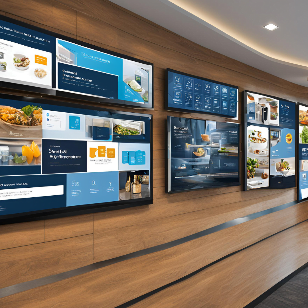
Digital signage is a relatively new and popular way of advertising that offers the flexibility and versatility of conveying your message. Digital displays are easily changeable, which means that you can change your messages to reflect sales, events or other special occasions. A digital board is also capable of displaying several messages at once with the ability to change after a certain period of time.
To the small business digital signage is an inexpensive way of getting more value from a single sign. It is especially helpful for restaurants, retail shops, and service-based companies with a changing inventory. You can also use animated elements or videos to get the attention of the customers and to provide more information in a less bulky manner.
3. Use Interactive Signage for Engagement
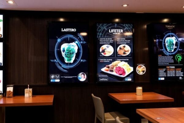
It is different from the normal display of message as it engages the customer. For example, a small shop may have a touch screen panel that the customers can use to select products or see what is on sale. Restaurants for instance may employ the use of digital menus where customers can place their orders and make their preferences before they are attended to by the restaurant staff.
Small businesses that have included interactive features in their signage give the customers a good experience. It can also provide you with useful information on which products or services are most in demand and therefore enable you to improve your marketing strategies.
4. Maximize the Power of Typography
It is therefore important to choose the right font as it can tell a lot about your brand. When it comes to signage, typography is one of the most important aspects of design that can change the perception of the audience. Simplistic and strong fonts are suitable for companies that wish to portray strength or plainness. However, script fonts tend to convey sophistication and innovation that would be suitable for boutiques, salons, or craft shops.
It is not a bad idea to try different font combinations, sizes, and even colors until you get the right one for your business. Only one thing has to be taken care of, and that is that the text has to be clear even from a distance. A sign that has been well designed in terms of appearance will not be effective if it is hard to read.
5. Leverage Lighting for Impact
Lighting is a very important aspect of signage and especially so for businesses that operate at night. LED lit signs are among the most common as they are energy efficient and can be used for different purposes from simple back lighting to neon like signs.
For small businesses, illuminated signs are a way of making your business easily noticeable, especially at night and this will create a good impression even from a distance. One can also come up with some form of creativity in the use of light where one can use spotlights to illuminate specific parts of the sign or even use LED lights of different colors to suit certain promotions.
6. Try 3D Signage for Extra Depth
While the flat signs are more conventional, the 3D signs are more engaging and can help your business to stand out. Dimensional lettering or logos have an element of depth and can provide a more interactive feel to the viewer. This type of signage is most effective when placed in the windows or the entrance of a business, if you want to get people to look at it.
3D signs can be made of foam, metal, wood or acrylic, which means that you can choose the material that will fit your brand’s image. They also provide the possibility to create interesting shadows and light effects, which will make your business’s exterior even more attractive.
7. Incorporate Local Art or Themes
It is therefore important to support the local artists and ensure that the signs that you put up contain community themes. For example, you can order a mural that will be not only a sign but also an art object that will be an ornament to the surrounding area. In case your small business is situated in an area with historical or cultural background, then it is advisable to incorporate historical or cultural symbols in your sign.
The customers will feel valued, and this will make your business to be part of the community and this will be of advantage to your business.
8. Add Humor or Whimsy to Stand Out
A witty or humorous sign can make a great impression, and people will take pictures and post them on the social media platforms thus promoting your business for free. For instance, a restaurant may decide to have a sandwich board with a quote related to coffee or a pet grooming shop may decide to include a pun or an illustration on their sign.
Humor is most effective for small businesses since it helps to create a more friendly image of your company. It’s just that the tone of your signs should reflect your brand personality; what may be funny for one company may not be funny for the other.
9. Use Eco-Friendly Signage for a Green Appeal
Many people are nowadays becoming conscious of the environment, and this means that they will appreciate your company if you use green signs. There are many ways that signs can be more environmentally friendly from using recycled materials, using solar power for lighting, to even using bamboo as a material.
This is a very useful strategy for the small business especially if the business wants to target the green consumer or if the business wants to be green in its operations.
10. Experiment with Color for Emotional Impact
Color is a very influential factor that may affect the consumer in one way or the other. When designing your signs, it is important that you select colors that are in harmony with your brand’s character and mood. Red and orange are warm colors and are attention grabbers as well as stimulating action while blue and green are cool colors and give a feeling of trust and calmness.
For small businesses colour is a straightforward yet powerful means of communicating mood and message. The only thing that you need to ensure is that the colour you have chosen for the sign is contrasting enough so that anyone will be able to read it even if they are far away.
Conclusion
Signage is an effective and innovative way that small businesses can use to attract the attention of their target audience, convey their messages and improve the shopping experience of their customers. Trying out various options with the use of materials, lighting, typography, and even humour, you can come up with a sign that will be not only eye-catching but also relevant to the audience. From the use of digital displays to the use of the environmentally friendly options, there are countless ways through which you can design your signage to match your business.


