Many schools and educational institutions cannot do without educational bulletin boards as they provide an interactive means of displaying information, recognizing accomplishments, and motivating learners. But, designing bulletin boards that will effectively attract the attention of the audience and at the same time, pass on the intended message can be quite a task. Below are some simple guidelines to assist you in creating appealing educational bulletin boards that will grab the students’ attention.
1. Define the Purpose and Theme
Before you get down to business there are several factors that you need to consider before designing your bulletin board. What is the purpose of this communication; to inform, educate, motivate or to celebrate? Knowing the purpose will help in the decision making of the design process. When you have your purpose then you need to select a theme that is relevant to it. The theme should be related to the content that you are going to present and should be of interest to the target audience.
For instance, if the bulletin board is to be created to commemorate an event, say Black History Month or Earth Day, then the theme has to be in harmony with that. It will also ensure that the board is not only appealing to the eye but also that the content is well organized and closely related.
2. Use Bold and Bright Colors
Color is one of the most effective ways of getting people’s attention. Choose bright and vivid colors that are opposite to each other to create an attractive bulletin board. But do not go overboard with the color as the board might end up looking like a mess of colors. It is recommended that no more than three or four colors should be used, and these colors should be used consistently across the board.
When choosing colors, it is important to understand the color psychology in order to know the feelings that certain colors may create. For instance, the color blue is usually linked with peace and stability while the color red is linked with passion and danger. Select colors that are relevant to the message you wish to pass across as well as the mood you would like to create.
3. Incorporate Visual Elements
Using pictures, diagrams, and other graphics can help to make a bulletin board more informative and more interesting to the viewer. They are used to divide text and make it more attractive. It may be useful to place pictures, graphs, diagrams or illustrations that are related to the theme of the bulletin board.
It can also be useful for educational bulletin boards for instance. It is a tool that enables the user to convey a lot of information in a simple and graphical form. Make sure that you use only high-quality images and videos that are also related to the content of the post.
4. Keep Text Clear and Concise
Although it is possible to use visuals to get the message across, text is still needed to pass information. The main idea is to avoid using complex sentences, to avoid using too many words and to make the text as understandable as possible. Choose big and clear fonts which can be easily seen from a distance. Do not use too many words as this may put off the viewer and they will not read what you have written. Rather, adopt the use of bullet points, headings, and short sentences to pass the message across.
Also, there is a need to consider the font style that is easy to read. Scripts or the decorative fonts are not very clear, especially if one is far away from the text. For body text, use plain and sans-serif fonts, and use special fonts only for titles and headings.
5. Organize Content Logically
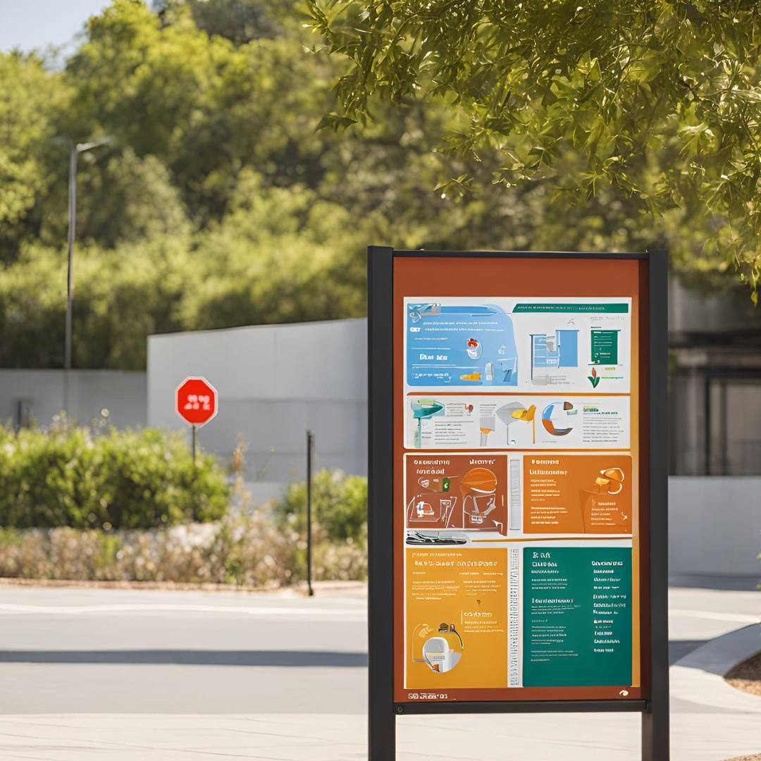
Organized bulletin boards are more informative and easier to comprehend than a messy one. Ensure that the content is presented in a coherent and structured manner through the use of headings and subheadings. This makes it easier for the viewers to be able to get the information that they are looking for. It is suggested that you use a grid layout to maintain the content in a proper alignment and structure.
Borders and frames can also be used to create divisions and divide certain areas of the board and make it look neat. Make sure that there is some space between different elements of the design so that it does not look too congested.
6. Add Interactive Elements
Interactive elements can be used to enhance the bulletin boards and make the students want to contribute. Some of the additional features that can be included include flaps that can be lifted, pockets that contain extra information, or spaces where students can write down their ideas or answers. These can be employed to conduct quizzes, puzzles or question and answer sessions and this makes learning more fun.
Another approach is to make a special section that will be updated with new information on a regular basis. This can make the students return to the board to see what is new and thus retain their interest in the content.
7. Use Quality Materials
If you are going to change the board frequently, then it is better to use materials that can be easily altered or swapped. Some parts of the video can be laminated to make them longer lasting and to be used over and over again for instance with title cards or labels.
8. Incorporate Student Work
Presenting students’ work on the educational bulletin boards is a good way to appreciate the students and make them feel proud of what they have done. It can also help to make the bulletin board more relevant to the students and hence more engaging. It is also possible to add student’s artwork, essays, projects or photos to the design.
When showing the work of the students it is important to do this in a dignified manner and make sure that they are recognized for their work. Perhaps it would be useful to change it more often so that more and more students could be involved in it.
9. Evaluate and Update Regularly
If the bulletin boards are not updated frequently, they tend to become boring and less productive. It is, therefore, important to take time and assess the contents of the bulletin board from time to time to see whether they are relevant and interesting to the students. Revise it with new content, topics and features to make it less boring and more engaging to the readers.
10. Seek Feedback
Last of all, ask the students and other teachers on how to enhance your bulletin board. They may have useful information and ideas which could be helpful in enhancing the quality of your bulletin boards. Ask the students to express their ideas about what they like or find beneficial.
Conclusion
The following ideas will help you design effective education bulletin boards without a lot of effort. With these simple guidelines, you will be able to create attractive, informative and entertaining bulletin boards that can effectively convey messages and enhance the learning process. Remember that the design should have a purpose, look good, and should be interesting and useful to the intended audience. Happy designing!


