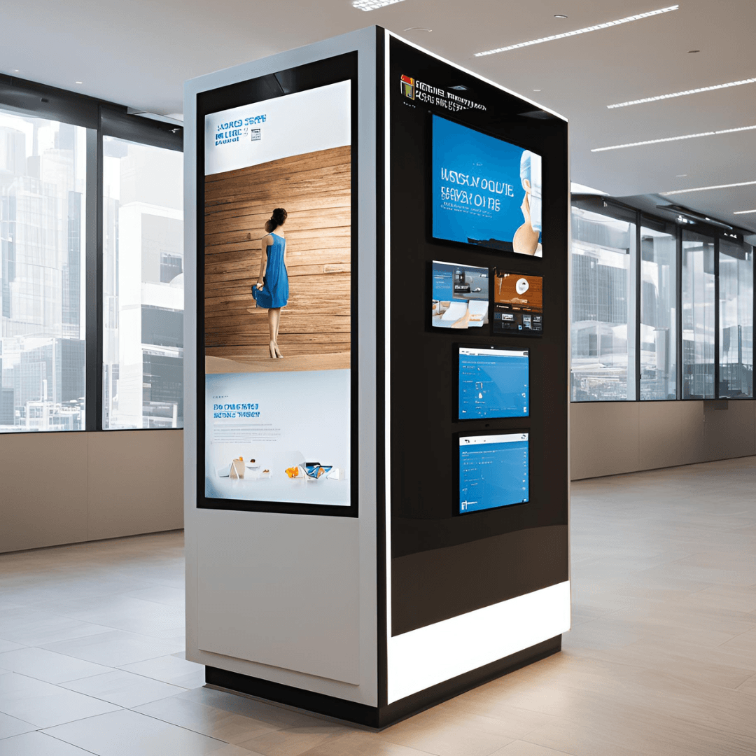
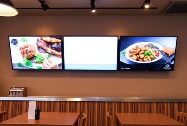
The modern world is actively developing with the help of technology, and therefore kiosks as digital signage solutions have become critically important. These kiosks come in handy when you are running a retail store, a restaurant, or even a service center because they are engaging and simple to use. However, having a kiosk is not the solution; the content in that kiosk must be useful and interesting to the targeted audience. In this blog, we will be breaking down the basic steps that can be followed in order to design captivating content for your digital signage kiosk.
1. Understand Your Audience
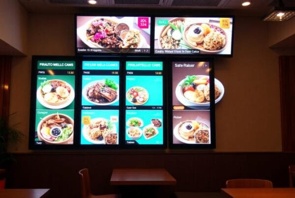
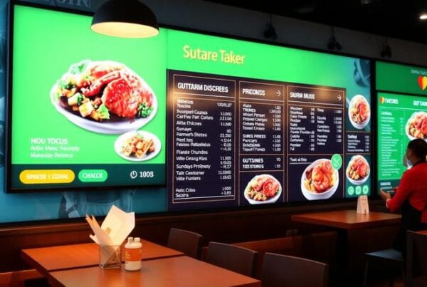
First, you have to know your audience to create effective content marketing content that will fit them. Who are they? What do they need and what do they want? For instance, in a fast-food restaurant; the digital kiosks are used to display the foods, offers and even nutritional value. While a retail store may employ kiosks to advertise new products or provide customers with service choices. The reason for targeting a specific group of people is that the material will be relevant and thus engaging.
2. Keep It Simple and Clear
The content placed on the digital signage has to be something that can be understood easily. The purpose is to convey your message as soon as possible. Avoid the use of a lot of words and complicated diagrams to pass your message across but use simple language and simple diagrams to pass your message across. Do not to clog your readers with too much text or intricate information. For instance, in an outdoor shoe selling kiosk, a message such as “50% off on all shoes today.” as well as a picture of the desired product may be more persuasive than a detailed explanation.
3. Leverage High-Quality Visuals
It is very important to note that use of visuals aids is very crucial in capturing people’s attention. Choose high quality images, video and animation that corresponds to your brand identity. Professional kiosk graphics make the content displayed more attractive and inviting to potential customers. Make sure that they or the videos are well lit, focused and are appropriate to the products or services you are advertising. If you are promoting a product, ensure that it appears as real as possible, if not even better!
4. Use Motion Wisely
There are two things that attract attention well – animation and motion; however, care should be taken not to use either excessively. It often reduces the viewers’ attention or overloads their perceptions to understand what is actually being presented. Some examples include, instead of having static text, the text should slide in, or products should appear as if they are rotating. For instance, a kiosk that has been created to advertise new stocks in a fashion store could use a slow, classy animation when presenting each item to attract attention in a classy manner.
5. Integrate Interactivity
No doubt, one of the best approaches of getting users to interact with your digital signage kiosk is through the use of interactive content. It is important to allow easy navigation through what is on offer via touch-screen capability. They should be able to window shop, view services or even buy goods and services from the kiosk. The features that allow users to actively participate in the process make them spend more time on the site, and make them feel special.
6. Highlight Promotions and Special Offers
Customers are always cautious when it comes to purchasing products and services, and a digital kiosk is a great way to advertise available offers, discounts or products that will be available within a limited time. Make sure that these specials stand out with bright and dark shades of color and font. Calling attention to sales that are soon to end may compel customers to make purchases they otherwise would not, and also make them feel they are getting a good bargain. A countdown timer also can also help to create a sense of urgency which can help to boost sales.
7. Ensure Accessibility
All the information that you post on your kiosk should be accessible to people with disabilities. Select big clear fonts and bright colors to ensure that a text is clearly readable. Any video content needs to have audio options or subtitles. If your kiosk is an interactive one, the touch screen must be easy to use and should be designed to suit the physically challenged.
8. Keep Content Fresh and Updated
Another common mistake that businesses make concerning the use of digital signage kiosks is discontinuing the content. Always change the appearance of your kiosk, with new offers, the new season or new services offered. Updating content makes repeat customers interested and convinced that your business is progressive and is being updated.
9. Measure and Manage Performance
In order to understand what kind of content will be more appealing to the customers, the performance of the kiosk should be analyzed. Most of the software solutions for digital signage include reporting tools that tell which pieces of content elicit the most attention. This data should be used in order to fine-tune your approach and enhance content as needed over time.
Conclusion
To develop interesting content for digital signage kiosks, one needs to determine the target audience, select and apply the bright and informative elements, make the content interactive and concise. If you adhere to all these best practices, then you can convert your digital kiosk into a marketing tool that can improve customer experience and increase sales for your business.


