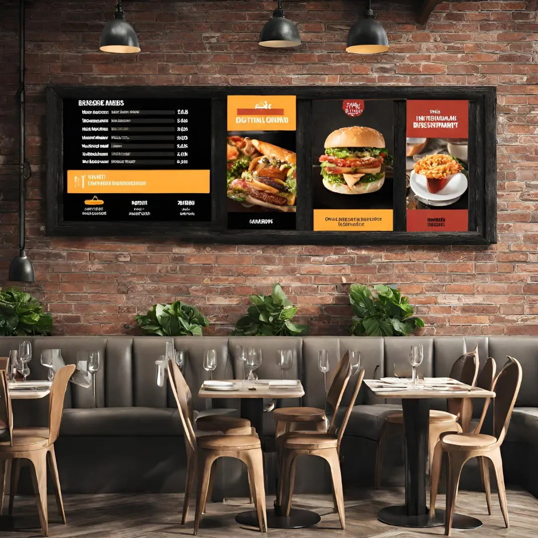
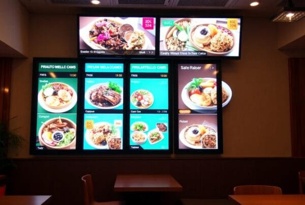
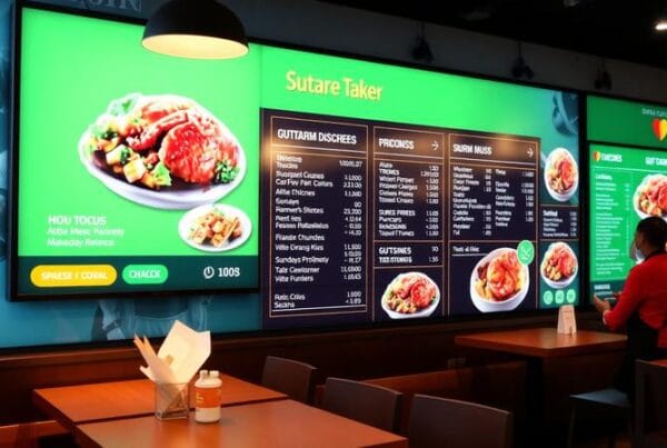
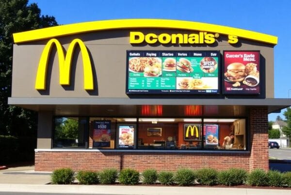
One of the most important things in the fast-paced world of restaurants is the impression created at first glance. Well-designed signage can create a great first impression. From being a hoarding or a signboard or even more generally known in the name board industry, restaurant signage meets the purpose of merely delivering the name of the place and stands as a major element that can alter the perceptions, bring footfalls, and hence ultimately boost the business. In this blog, we will see why restaurant signage designing is important, its best practices, and some examples.
The Importance of Restaurant Signage Design
Attracting Attention
Restaurant signage should be designed to attract the attention of potential customers. In a busy street with many dining options, the best sign can make all the difference. People on the street are attracted by the compelling design of a sign, and this interest is relayed to the customers.
Conveying Brand Identity
Signage is a means to communicate a bit of brand identity. It sets a tone or previews what the diners will experience. For example, an elegant, beautiful experience may mean a modern, sleek sign that employs a minimalist design aesthetic to people on the street; the contrary is a rustic, hand-painted sign to talk of a cozy, warm experience. The design components—font, color, and even graphical motifs—should all be in line with the other cues in the broader brand identity.
Providing Information
It would offer valuable information, including the type of cuisine, the operating hours, special promotional offers, or even a sneak peek at the menu. Properly designed informative signage facilitates the customer’s quick decisions, which can be the determining factor in their choice of place to eat.
Enhancing Visibility
Visibility is a key factor, especially at locations with high competition or massive foot traffic. Properly placed and illuminated signage makes sure the restaurant is seen by people both during the day and at night. If that’s done, it’s more visible to passersby, increasing the possibility of customers coming during any time of the day and in any weather.
Best Practices for Restaurant Signage Design
Know Your Audience
Audience understanding lays the foundation for an effective design of your signage. Before you even think about colors, you should first understand who you are targeting with your signs. Who, exactly, is your potential customer? Is it the young, trendy, and hip adult, or is your restaurant more geared towards the family lifestyle? Depending on this, a significantly different design specifically targeted at this demographic could be so much more effective.
Simplicity is Key
While signage must grab their attention, it is important to keep their design simple. Where signage is meant to convey information, a complicated design only frustrates interest in the conveyed information. Use clear and legible fonts, uncomplicated graphics, and a layout that makes it easy for the eye of the viewer to smoothly traverse the information.
Quality Materials
Good quality materials will drastically improve the appearance and durability of the signage. Ensure weather-resistant materials are used to ensure the sign retains its great look over time. A good finish exudes professionalism and an eye for detail.
Lighting Signage Design
Forms of lighting that increase the attractiveness of the sign increase visibility during the night. Design creatively to allow space for the LED lighting, backlit signs, or spotlighting that you might decide to add in the future. This will make your signage stand out in any lighting scenario.
Consistent Branding
Consistency in terms of color, font, and design elements across all of a restaurant’s visual elements will create a professional and integrated image. The signage should project the same look as other branding material such as the menus, websites, or pages on social media.
Legal Compliance
Check that your sign complies with the law, including local regulations and zoning laws. This could cover sizes or placement regulations and even include requiring a permit. Not following these guidelines could result in a fine or the need to remove and redesign your signage.
Inspiring Examples of Restaurant Signage
In-N-Out Burger: The Neon Appeal
In-N-Out Burger’s iconic neon signage is an exemplary case of how impactful lighting can make a brand statement that is memorable and one that everybody can instantly identify with. The combination of bright red and yellow neon lights in this one is arranged in a way that the spot becomes visible from afar and sends feelings of nostalgia and festivity.
Cracker Barrel: Rustic Charm
The Cracker Barrel signage uses rustic wooden elements and vintage-style lettering to broadcast the ambiance of home-y, country-in-the-city to its chosen demographic. Basically, the signage design resonates with the restaurant’s entire brand identity in the market.
Nobu: Minimalist Elegance
Nobu’s signage exemplifies really good design in a minimalist approach. It uses such a simple yet elegant font and the most subtle palette, which screams a lot about the high-end, sophisticated dining experience that the restaurant provides. This kind of understated approach speaks to a clientele who loves luxury and exclusivity.
Shake Shack: Playful Vibes
Shake Shack’s signage employs a fun font in bright green colors, showcasing that it is designed to exude the playful spirit of the brand. Design features such as the playful fonts and the shiny green definitely pop out and exude the fun and lively spirit that the brand exudes. Certainly, that is one approach to make the designs appealing to all audiences yet still inviting to draw their attention.
Conclusion
Restaurant signage is one of the most important aspects of a smart restaurant strategy, if not the most important. It should stand out, it should be able to communicate what is necessary and also correspond to the identity of the restaurant. If done effectively—meaning keeping your audience in mind, keeping it simple, quality materials, the right kind of lighting, keeping the brand consistent, and legal requirements—restaurants can have great signage that works to attract customers and makes their businesses get noticed. Whether it be the nostalgic glow of neon light or the sleek elegance of minimalist design, the right signage plays its cards right in the competitive world of dining.


