Introduction
In the extremely competitive world of dining, a well-done restaurant menu board may make all the difference when it comes to the success of a restaurant. Restaurant menu board design is more than merely stating what the customers are allowed to order or how much you are going to charge them for it; it is how you present what you offer in a convincing and effective manner. This guide covers the significant elements of successful restaurant menu board design and offers tips and strategies on how you can make your menu boards perform to their optimal capacity for you.
The Importance of Restaurant Menu Board Design
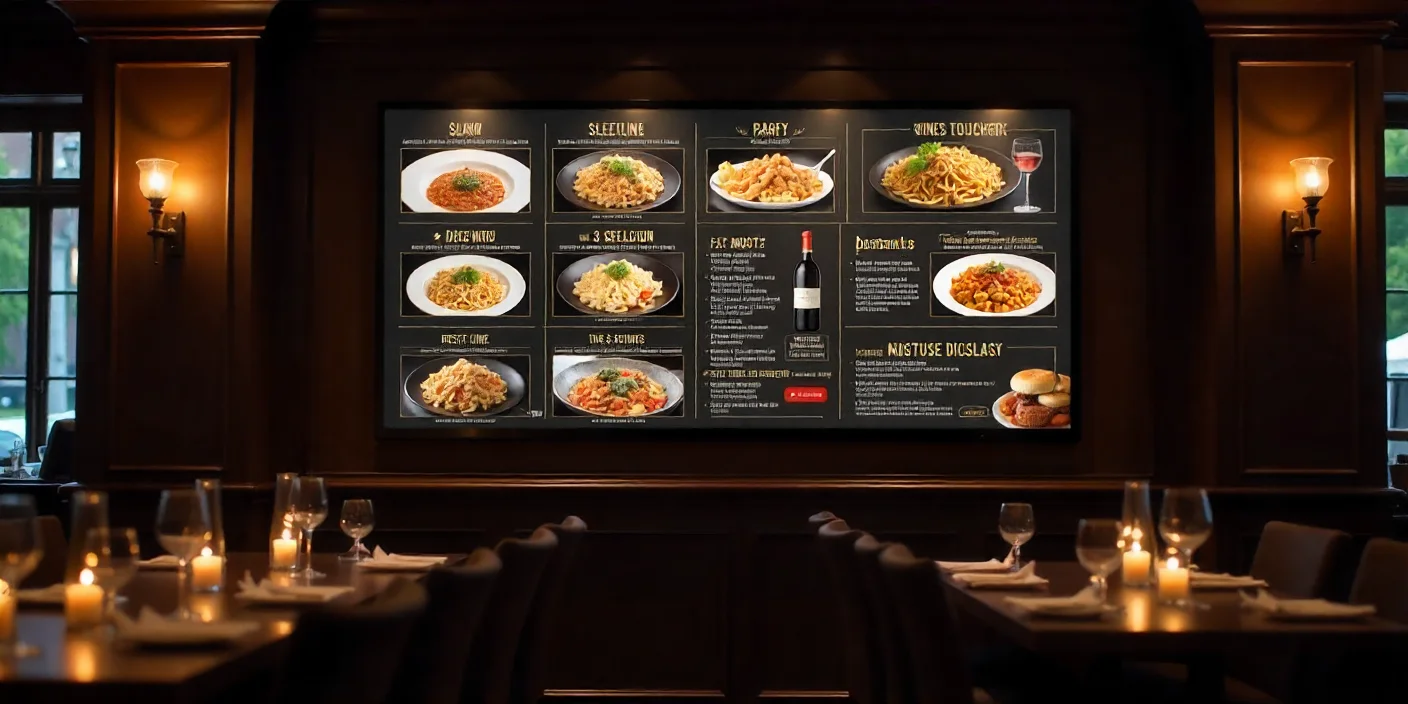
First Impressions Matter
A restaurant menu board is typically the first thing through which customers interact with what you have to provide. A beautifully designed menu board makes a permanent first impression that attracts potential customers toward getting to know more about the things you serve. It establishes the mood when it comes to dining and helps the process of decision-making for a customer to dine in your restaurant.
Enhancing Customer Experience
Successful menu board design means that the customer can locate what they need to in a menu and make a decision in a short amount of time. This is particularly important during high-traffic occasions, such as quick-service restaurants (QSRs) and food courts.
Boosting Sales
Strategic design, such as highlighting high-margin offerings or the day’s specials, can drive incremental sales that raise revenue. A visually appealing and easy-to-use menu board will encourage customers to order more than their initial choice, such as an appetizer, beverage, or dessert.
Key Elements of Restaurant Menu Board Design
Clarity and Readability
Font Selection
Typeface should be chosen that is legible from a distance. More commonly used are sans-serif typefaces like Arial, Helvetica, and Verdana because of their clean appearance. Avoid using overly decorative fonts that can be hard to read.
Text Size and Spacing
Make the text large enough to be seen from varying distances. Spacing between lines and sections should be adequate enough to prevent a congested and confusing look of the menu.
Layout and Organization
Logical Grouping
Group the menu items in logical groups, such as appetizers, main courses, sides, and desserts. This way, it is relatively easy for the customers to find what they are looking for, perusing the menu with ease.
Hierarchy
Use visual hierarchy to lead the customer’s eye to the most important items. Putting certain items in larger text, bold type, or in a different color will highlight them and draw the customers’ attention to high-margin or signature items.
Visual Appeal
Color Scheme
Use a color scheme that goes with and complements the branding of your restaurant and acts as an aesthetically pleasing contrast. Colors can be used strategically to make certain items or sections of the menu stand out.
Images and Graphics
High-quality photographs of menu items can spark a customer’s appetite and make the menu more visually appealing. However, use images sparingly to avoid clutter. Graphics and icons can also be employed to help denote unique dietary offerings, like vegetarian or gluten-free items.
Consistency
Consistency with design elements such as choice of fonts, colors, and imagery should be maintained across all the menu boards. This provides a consistent brand identity and allows for a cohesive look.
Types of Restaurant Menu Boards
Static Menu Boards
Static menu boards refer to traditional, printed boards that display a static menu. They are cost-effective and easy but don’t allow for much flexibility for frequent updates.
Digital Menu Boards
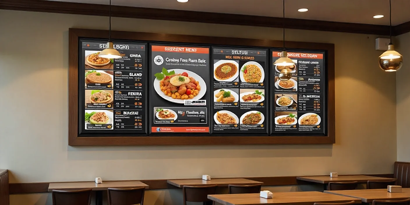
Digital menu boards provide dynamic content that can be updated and customized frequently. They are perfect for showing rotating specials, seasonal items, and promotional content. Digital menu boards can also provide video and animation to provide better engagement.
Chalkboard Menu Boards
Chalkboard menu boards provide a rustic and customizable option. They are perfect for the cafe, bistro, and casual dining places. Chalkboards provide easy updates and can be a creative way to display daily specials.
LED Menu Boards
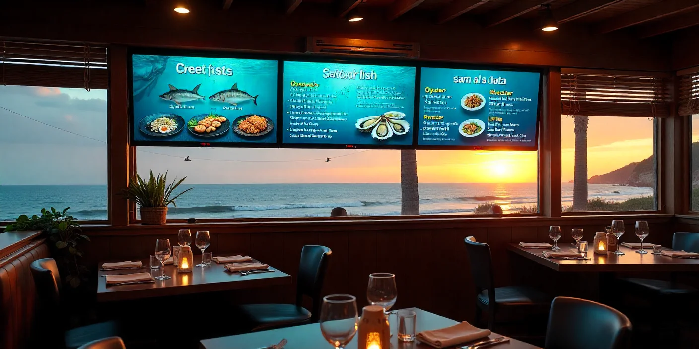
LED menu boards are energy-efficient and provide high visibility and are good for indoor and outdoor usage. They provide bright, clear displays that can draw attention even in well-lit environments.
Steps to Designing an Effective Restaurant Menu Board
Understand Your Brand and Audience
Brand Identity
Your restaurant’s brand identity should be a guiding force in the design of your menu board. Whether you are upscale, casual, family-friendly, or hip, the design elements of your menu board should be consistent with your overall brand image.
Target Audience
Consider your target audience as you design your menu board. A family-friendly restaurant will do well with a bright and cheerful design, while a fine dining restaurant should have a more polished and elegant look.
Plan the Layout
Menu Structure
Determine your menu structure. Choose your categories and subcategories, and make sure that the most important items are at the top of the list. Use headings and subheadings to create a well-organized and easy-to-follow structure.
Placement
Consider the placement of your menu boards carefully. They should be placed in a location where customers can easily see them but without disrupting the flow of traffic. They should be at eye level and be well lit.
Choose the Right Design Elements
Typography
Choose your fonts carefully to ensure that they are legible and reflect your brand’s personality. Use font sizes and styles to create hierarchy and to draw attention to key items.
Colors
Choose colors that aid in readability and that are consistent with your brand. Use contrasting colors for the background and text to ensure that the text is able to stand out.
Images and Icons
Use high-quality images of your most popular dishes to make your customers salivate. Use icons to highlight special dietary offerings or popular items.
Test and Refine
Prototype Testing
Create a prototype of your menu board and test it with a sample of customers. Get feedback on readability, layout, and overall appeal.
Iteration
Refine your design based on the feedback you receive. Continue to test and iterate through your menu board to make sure that it continues to be effective and engaging.
Trends in Restaurant Menu Board Design
Minimalistic Design
Minimalistic design focuses on simplicity and clarity, with clean lines, a lot of white space, and a limited color palette. Minimalistic design serves to direct customers to what they are looking for easily without thinking too much.
Interactive Digital Displays
Interactive digital menu boards serve the purpose of enabling the customers to engage with the menu, for example, browsing through the categories, looking at elaborate descriptions, and even making an order. The technology delivers value to the customer and also adds simplicity in the process of ordering.
Personalization
Personalized menu boards are able to display patrons personalized recommendations based on their preference and also their previous purchases. The trend uses data analytics to deliver better customer satisfaction and give them a reason to come back.
Sustainability
Eco-friendly menu boards made from sustainable materials are on the rise. More and more restaurants are using digital boards or recycled material for the printed boards as a way of reducing their environmental footprint.
Case Studies: Successful Restaurant Menu Board Designs
Fast-Food Chain: McDonald’s
McDonald’s makes use of digital menu boards in all its restaurants to feature dynamic content like promotional products and seasonal specials. The digital nature of the boards makes them easy to update and maintain franchise uniformity.
Upscale Restaurant: The Cheesecake Factory
The Cheesecake Factory’s menu boards contain high-quality images of their offerings, which are well-segmented into categories. The design is in line with the upscale nature of the restaurant and makes it easy for customers to navigate the extensive menu.
Coffee Shop: Starbucks
Starbucks makes use of chalkboard-style menu boards to create a warm, artisanal feel. The hand-written font as well as creative design elements reflects the brand’s personality and makes the menu feel approachable.
Local Bistro: The Farmhouse Inn
The Farmhouse Inn makes use of a mix of chalkboard and digital menu boards to feature daily specials and seasonal offerings. The rustic design is in line with the restaurant’s farm-to-table theme and creates a cohesive brand experience.
Common Mistakes to Avoid in Menu Board Design
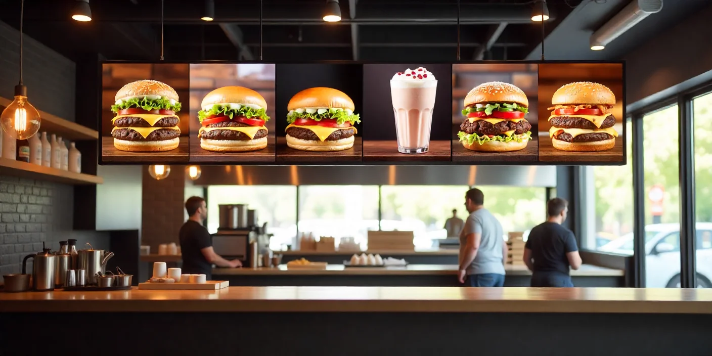
Overloading with Information
Try not to feature too much information on your menu board. An over-cluttered menu can overwhelm the customer and make it hard for them to make a selection.
Poor Readability
Ensure that your text is readable from a distance. Do not make use of overly-ornate fonts or colors that may not be visible.
Ignoring Brand Consistency
Your menu board design has to be in line with your brand’s personality. Inconsistent design elements can make your customers confused and disconnect your brand’s personality.
Neglecting Updates
Ensure that your menu board is up-to-date with your offerings and prices. An outdated menu can irritate customers and lead to dissatisfaction.
Conclusion
Restaurant menu board design is an important element in creating an attractive and successful dining experience. From careful attention to clarity, visual appeal, and strategic organization, you can make a menu board that not only improves the customer experience, but the bottom line and brand identity as well. Whether you opt for static, digital, chalkboard, or LED menu boards, the most essential issue is to find a design that speaks to your audience and accurately reflects the unique personality of your restaurant. With careful forethought and ongoing refining, your menu board can become a powerful conduit in propelling the success of your restaurant.

