Food trucks have become a ubiquitous sight on city streets, offering a diverse array of culinary delights to hungry patrons. But amid the hustle and bustle of urban life, how can food truck owners ensure that their menu boards stand out and entice customers to place an order? The answer lies in the science of effective menu design.
First impressions matter, and a well-designed menu board can make all the difference in attracting customers and boosting sales. But it’s not just about aesthetics – there’s actual science behind what makes a menu board effective.
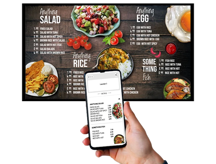
- Visual Hierarchy: When designing a menu board, it’s essential to prioritize items strategically based on their profitability or popularity. Studies have shown that customers tend to focus on items placed at the top and center of the menu board. Highlighting your best-selling or high-margin items in these prime spots can increase their visibility and likelihood of being chosen.
- Limited Choices: While offering a wide variety of options might seem like a good idea, too many choices can overwhelm customers and lead to decision paralysis. Instead, streamline your menu board to feature a curated selection of your most popular and profitable items. This not only simplifies the decision-making process for customers but also helps to highlight your signature dishes.
- Descriptive Language: The way you describe your menu items can have a significant impact on customers’ perceptions and preferences. Use descriptive language that evokes sensory experiences and highlights the unique qualities of each dish. For example, instead of simply listing “Burger,” try “Juicy Angus Beef Burger with Melted Cheddar and Crispy Bacon.”
- Visual Imagery: Incorporating high-quality images of your menu items can stimulate customers’ appetites and increase their desire to order. However, be selective in your use of images and ensure that they accurately represent the appearance of the dishes. A mouth-watering photo of your signature dish can be a powerful tool for enticing customers.
- Font and Color: The typography and color scheme of your menu board play a crucial role in conveying your brand identity and creating visual appeal. Choose fonts that are easy to read and align with the style of your food truck. Similarly, opt for colors that complement your brand aesthetic and evoke the desired mood or atmosphere.
- Clear Pricing: Transparency is key when it comes to pricing. Make sure that prices are clearly displayed next to each menu item to avoid any confusion or sticker shock for customers. Consider using strategies such as tiered pricing or bundling options to encourage upselling and increase the overall value perception.
- Seasonal Specials: Keep your menu board fresh and exciting by featuring seasonal specials or limited-time offers. Not only does this create a sense of urgency for customers to try these exclusive items, but it also encourages repeat visits as they anticipate what new delights you’ll have in store next.
In conclusion, the design of your food truck menu board is more than just a matter of aesthetics – it’s a science. By understanding the principles of visual hierarchy, limited choices, descriptive language, visual imagery, font and color, clear pricing, and seasonal specials, you can create a menu board that effectively captures customers’ attention and drives sales. So, the next time you’re revamping your food truck menu, remember to harness the power of science to boost your sales and delight your customers.


