Introduction
The internet is noisy. Screens are everywhere for customers in restaurants, shops, offices, hotels, workout centers, clinics and shopping malls. However, nowadays it is not sufficient to have a screen. When the message is cluttered, difficult to read or improperly organized, people just turn away.
This is why digital signage layout is so important. A screen may be bright, costly and perfectly mounted, but when the content is poorly packaged, then it will not sell, direct, inform or entertain. A lot of companies spend on displays and software, but fail because the message on the screen does not work.
Good visual communication is based on a good layout. It determines whether the headline is placed above or below the image, the size of the image, the amount of text displayed, the position of the call to action and the speed at which the viewer can understand the message.
Nento assists companies in streamlining the process using digital signage software, templates and service to make the screens more useful. Whether it is a restaurant, retail store, office or service business, the aim is the same: create screens which people look at and make sense of.
Need a screen that supports sales? Contact Nento today to see how our solutions can transform your visual strategy.
What Is Digital Signage Layout?
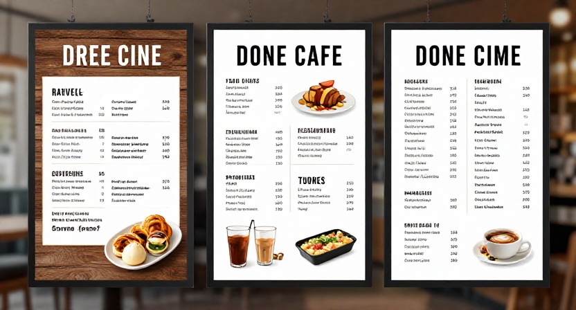
Digital signage layout refers to the arrangement of visuals on a screen. This encompasses text, images, videos, colors, logos, icons, whitespace and call-to-action buttons or messages.
In simple terms, layout is the placement of everything.
An effective design makes the message understandable. A weak layout makes the viewer work too hard.
The Psychology of Screen Space
Screen reading is not the same as book reading. Viewers scan. Their eyes move fast and seek the most significant information first.
There are two popular scanning patterns that can be used in digital signage:
- Z-pattern: The eye moves from upper left to right, and then down diagonally and to the bottom. This is suitable for simple promotional screens.
- F-pattern: The eye reads shorter lines downward on the left side, then scans across the top. This is good for menus, lists and information boards.
These patterns can be used to develop improved digital signage designs. The essential messages should be placed at the first point where the eye flows.
Key Elements of a Strong Layout
Most good signage screens have several main components:
- Headline: The primary message or offer.
- Main visual: A product image, video, graphic or background.
- Body text: Brief supporting information.
- CTA: What the viewer should do.
- Branding: Brand style, colors and logo.
The aim is not to cover every inch of the screen. The aim is to focus the attention.
Digital Signage Is Not Print Design
A flyer or poster can be read close up, whereas digital signage is often read at a distance and in a few seconds. That alters the design principles.
Motion, viewing distance, brightness, size of the screen and timing are all important. What may appear attractive on a laptop, might not look attractive on a 55-inch screen in a very busy restaurant or retail area.
Quick rule: if the message cannot be understood in a few seconds, the layout is too complicated.
The Role of a Digital Signage Template Designer
A digital signage template designer assists in the creation of reusable screen designs that can be used by the business over and over again. Templates offer a framework on which screens can be created for menus, promotions, announcements, offers, wayfinding, and product highlights.
Why Starting From Scratch Is Often Inefficient
Custom design may come in handy, however, manually designing each screen can be a time-consuming task. It may also cause inconsistent branding because different individuals may design different screens.
This is addressed through templates that provide a ready-made structure to businesses. You can modify the text, images, prices or offers but maintain the same design.
What a Template Designer Does
A digital signage template designer concentrates on the modular design. This means developing layouts that can be reused in various messages and types of screens.
As an example, daily specials, combo meals, breakfast menus and seasonal drinks could be shown through a single restaurant template. Product launches, discounts and loyalty offers may be displayed using a retail template.
The designer ensures that there is proper layout spacing, readable fonts, high contrast, safe zones and clear hierarchy.
The Benefits of Templates
Templates save time, save on design costs, and protect brand consistency. They can be very useful to companies that have many screens or locations.
By having the appropriate digital signage content templates, teams are able to change messages quickly without having to redesign everything. This is significant to restaurants, retail stores and service businesses that have a high turnover of content.
DIY vs. Professional Design
Some companies may use built-in applications and online design templates to develop useful screens on their own. Others require assistance from a digital signage design company particularly in cases of a large network, a new brand or a complex interactive content.
The most suitable option is based on your team’s design abilities, number of screens, brand requirements and content requirements.
Skip the guesswork. Nento’s team of experts acts as your dedicated design partner, helping every screen look professional. Get a free demo here.
Essential Elements of High-Converting Layouts
A high-converting layout does not only need to look beautiful. It has a job. It might have to sell a product, advertise an offer, direct customers, lessen waiting frustration, or clarify significant data.
Contrast and Readability
Text should contrast with the background. One of the most common signage errors is low contrast. To illustrate, yellow text on a white background can appear soft, yet hard to read.
Use high contrast between text and background. Keep fonts clean. Important information should not have overly decorative typefaces.
Visual Hierarchy
Visual hierarchy tells the viewer what to look at first, second and third. The primary offer must be most prominent. Supporting details should be smaller. Branding must be present but not too overwhelming.
A clear visual order assists the viewers in comprehending the screen fast.
Whitespace
Negative space, or whitespace, is the space between design elements. It simplifies a layout and makes it easier to scan.
Most businesses attempt to incorporate too much on a single screen. This undermines the message. Less content works better since the viewer is able to concentrate.
Motion With Purpose
Digital signage can be made more interesting with motion, but it should be used sparingly. A simple animation can be used to draw focus to an advertisement. It is possible to make a product more attractive with the help of a short video.
However, constant motion is distracting. The message should not be in conflict with the motion.
Types of Digital Signage Layouts
Different goals need different layouts. The best format depends on the audience, screen location, and message type.
| Layout Type | Best Use | Main Benefit |
| Hero layout | Brand messages, product launches, offers | Strong visual focus |
| Split screen | Menu plus promo, service plus announcement | Shows two messages clearly |
| News ticker | Updates, social feeds, live information | Keeps content moving |
| Grid layout | Product collections, menu categories | Shows multiple items neatly |
| Interactive layout | Touchscreens, kiosks, directories | Supports user control |
The Hero Layout
The hero layout consists of a large image or video and little text. It is perfect for branding, product promotion, and specials.
In the case of a restaurant, one featured burger can be displayed with a short CTA. A retailer can display a piece of merchandise with a sales message.
The Split Screen
The split-screen design splits the screen into two or more parts. This is good when a business requires displaying a menu on one side and a promotion on the other.
This format is frequently used by restaurants since it balances information and selling.
The News Ticker
A ticker layout can be helpful for scrolling updates, live announcements, social media feeds, or news. It should be used sparingly in that excessive movement may end up distracting from the intended message.
The Grid
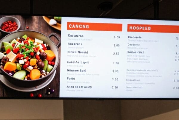
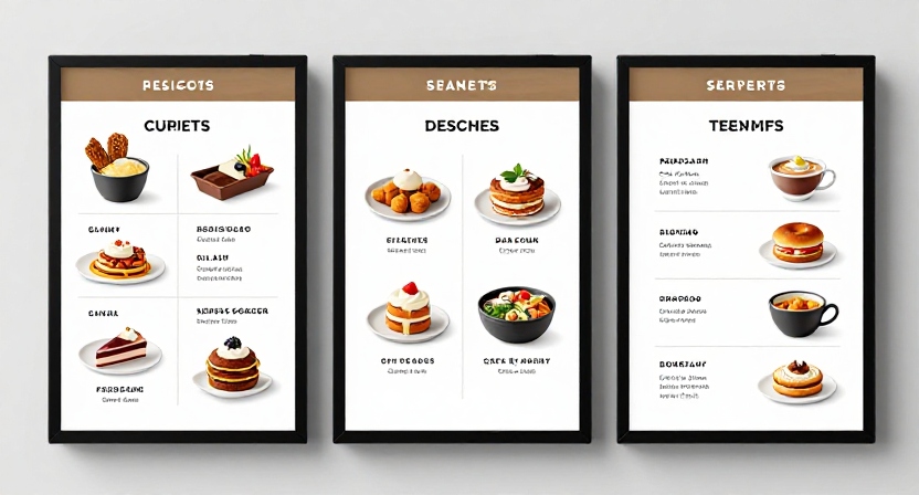
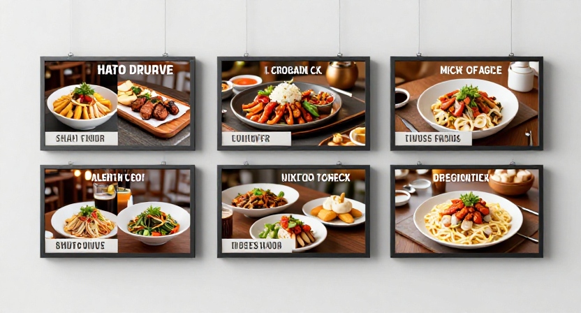
A grid design is useful for displaying a range of products simultaneously. It is usually found in retail, restaurant menus, service boards and product comparison screens.
Interactive Layouts
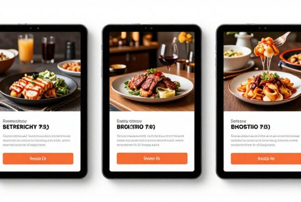
Interactive layouts are created to work on touch screens. These require bigger buttons, easy-to-understand navigation and simple routes. The user should not be confused about where to tap.
How to Create Digital Signage Content
The question many businesses ask is how they can make digital signage content that works.
Strategy, rather than design software, is the starting point.
Step 1: Know Your Audience
Who will be looking at the screen? Are they customers in a restaurant queue? Passersby near the window? Breakroom employees? Lobby visitors?
Also take into account viewing distance. A screen 20 feet away will require bigger text than a kiosk-based screen.
Step 2: Choose the Right Tools
Good software makes design easier. Applications such as Nento assist companies in creating, scheduling and managing content without having advanced design skills.
Templates, media uploads, scheduling, remote updates and multi-screen control should be supported by a powerful platform.
Step 3: Focus on Digital Signage Content Design
Digital signage content should be designed for the medium. Make use of high-resolution images, RGB color mode, correct aspect ratios and font sizes that are usable at actual viewing distance.
A screen is not a printed flyer. It should have bigger font, simpler messages, and stronger spacing.
Step 4: Use the Rule of 3
In approximately three seconds, a good screen should convey a single message. This does not imply that all the details should be comprehended immediately. However, the viewer is able to quickly understand the content of the screen.
One offer. One main visual. One clear action.
Step 5: Make It Accessible
Digital signage ought to be easily understood by more people. Use fonts that are easy to read, strong contrast, plain language and do not use color alone to convey meaning.
Accessibility is not only a good practice. It also simplifies the message for all people.
Top Digital Signage Design Ideas and Inspiration
The best digital signage design is not necessarily very complicated. The simplest, focused and readable digital signage designs are some of the finest designs.
Seasonal and Holiday Themes
Businesses can update the digital display templates on holidays, seasonal sales, neighborhood events and special offers. For example, restaurants can use summer drink menus, Black Friday deals, Christmas specials, or Valentine’s Day specials.
The screen is updated according to the season.
Minimalist Corporate Displays
Clean lines, neutral colors and plain typography tend to work well in offices, clinics, hotels and professional spaces. Welcome messages, meeting room directions, announcements or brand statements can be displayed on these screens.
Dynamic Retail Screens
Sample digital signage concepts can enable retailers to display real-time inventory, featured products, limited-time offers, and customer reviews.
A screen at the entrance can be used to display a current offer and a screen within the store which can direct shoppers to a particular section.
Interactive Wayfinding
Wayfinding screens assist visitors in locating rooms, stores, offices, gates or service areas. Such layouts should be straightforward and practical.
An attractive map is not helpful when individuals cannot comprehend it quickly.
Ideas for Restaurants and Cafes
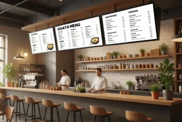
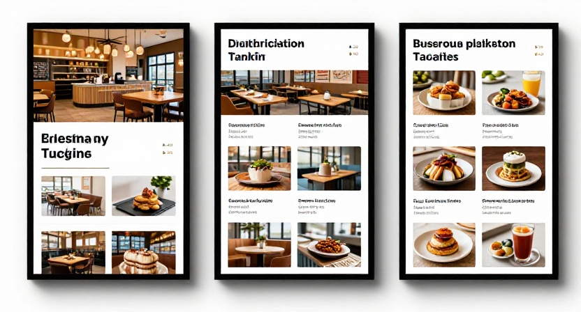
Digital menus, combo offers, order pickup numbers, and limited-time deals can be displayed on screens and used by restaurants. Cafes may utilize soft colors, cozy photography, and basic designs to advertise drinks, pastries, and loyalty programs.
The following digital signage design concepts can assist in making businesses align with the mood and the location of the customer.
The Power of Digital Signage Content Templates
One of the simplest methods to enhance speed and consistency is using digital design templates. They assist teams to develop professional-looking content without having to start over again.
Consistency Across Locations
In the case of businesses that have more than one location, consistency is essential. Digital signage content templates ensure all screens follow the same brand.
Even when the local teams update the content, the colors, fonts, logos, spacing and CTA styles will remain the same.
Scalability
It is not difficult to handle a single screen. It is different when managing 100 screens. Scaling can be achieved with templates without losing control.
One campaign template can be developed by a business and configured to suit various locations, languages, offers or screen sizes.
Aspect Ratios and Screen Formats
Digital display templates need to be adjustable to various screen orientations. Landscape displays are suitable for menu boards, promotions and lobby displays. Portrait screens are effective in kiosks, directories, posters and on narrow walls.
Both formats should be included in a powerful template library.
Faster Campaign Launches
Templates assist companies in starting campaigns faster. Rather than having a designer make all the versions, teams can make changes to pre-approved layouts by adding new text, pictures, and prices.
It comes in handy especially in restaurants, retail chains, gyms and service businesses that carry out regular promotions.
Ready to scale your message? Nento offers an extensive library of customizable templates designed for any industry. Browse our library now.
Common Layout Mistakes to Avoid
Good screens will not work when the layout is bad. These are errors that usually decrease engagement.
Information Overload
Excessive text can cause people to stop reading. Digital signage ought to be easy to comprehend. The message might not fit on a screen if it requires a paragraph.
Poor Contrast
Low contrast reduces legibility. Do not use colors that will cause text to blend into the background.
Ignoring Safe Zones
Text should not be too near the edge of the screen. Content can be difficult to read due to bezels, mounts or screen cropping. Keep adequate spacing between important information.
Static Content for Too Long
A screen that does not change becomes invisible. Viewers no longer pay attention to it.
Refresh content after a couple of weeks, or even more frequently in the case of a time-sensitive message.
No Clear CTA
Each promotional screen must inform the viewer what to do next. Buy now. Scan the QR code. Ask at the counter. Visit the website. Book today.
The layout will not be complete without a CTA.
Frequently Asked Questions
What is the standard resolution for a digital signage layout?
1080p (1920×1080) is still common and 4K is rising in popularity. The design should use high-resolution images and scalable design features so that it appears sharp on bigger screens.
Nento’s tools assist in scaling resolutions automatically.
Do I need a graphic designer to create digital signage?
Not always. Many business owners can create effective layouts, with intuitive tools and ready-to-use digital signage content templates. Nevertheless, more complicated campaigns, brand systems or large screen networks can be supported by a professional designer or digital signage design company.
How often should I update my digital signage layout?
Layouts should be updated at least every few weeks. When the screen displays menus, news, sales, events or seasonal information, then it should be updated more often.
What is the most important element of a digital signage layout?
One of the most significant aspects is the call to action. When viewers are not aware of what to do next, then the layout has not completed its task.
How does Nento help with layout design?
Nento offers a drag-and-drop platform, business-friendly templates, content management, and support to enable businesses to create layouts that are branded, readable, and user-friendly.
Conclusion
An effective digital signage design balances design and functionality. It has to be attractive, but it has to communicate quickly. The most effective layouts are based on clear hierarchy, high contrast, readable text, intelligent spacing, and a clear call to action.
This is facilitated by templates. They assist companies in remaining consistent, save time, and replicate content across various screens without compromising quality.
With developments in digital signage, layouts will be even smarter. With AI-powered tools, it may soon become possible for businesses to change layouts depending on the behavior of the audience, time of day, or the effectiveness of campaigns. The fundamental rule will remain the same, though: concise message, powerful structure and meaningful design.
Do not leave your screen presence to chance. Nento can be your visual signage partner, whether you require one screen, or a network of displays.
Book a consultation with Nento today and start building layouts that engage.